UX DESIGN

GOOD VS BAD UX DESIGN

style scape for Eindhoven Rockcity

What have I done?

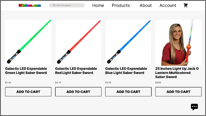
In the starting week I made the assignment of improving a bad UX and downgrading an already good UX. For improving the bad UX I chose a website called blinkee, items were not aligned to each other well and there was not consistent placement at all over the entire site. There was also an information overload both in the navigation bar as well as in the items you could shop for. So to improve this site I started with the navbar, where I deleted some double items to make more space for each navbar item, and then lined these out better. For the item cards, I removed some of the extra information and made a seperate pop up for that when you add it to cart, such as bulk price, the amount you want or wether you have a discount code. By removing these items from the item cards they became less busy and it became more easy to view the actual products. Also I alligned all the items better so that they were all spaced out evenly.

Then for the good UX that I made worse I chose for Korean Air's website. Here I deleted a bunch of the essential tools to easily navigate the website such as a search bar. I also made it impossible to switch destinations around when booking flight tickets, this means that if you accidentally put the destinations in wrong you have to correct them by hand instead of simply switching them around. I also made the layout and elements uglier and less easy to use by removing dividers so people do not know where one section ends and another one starts.
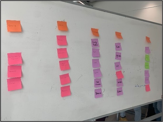
More information about what exactly was changed and more images can be found in the extra information document.

What have I learned?

  • What heuristics of UX are and why they are important.
  • I could have also improved the UI of the blinkee site instead of keeping their simple white design.
Read more

CARD SORTING IN CLASS

style scape for Eindhoven Rockcity

What have I done?

In groups we researched different websites in class to see if their navigation bars are actually accessible and logical for people to use. Me and my group chose MediaMarkt. To do the card sorting we picked a few of their categories in their navigation and ten subcategories for each of the main categories. We wrote the categories down on sticky notes as well as all the subcategories we chose for each category on separate sticky notes.

We did 2 round of card sorting, one open card sorting and one closed card sorting. We started with the closed card sorting where the participants were already given the main categories and then had to divide the sub categories amongst the main categories according to what they thought would be the best fit. During this we found out that a lot of the sub categories could fit into multiple main categories, especially the gaming, computer and audio categories had a lot of sub categories that could be placed in multiple of these categories.

During second round of card sorting we did an open sorting, this meant that the participants were not given the main categories, only the sub categories and they had to put together the sub categories that they thought would be in one main category together and then name what they thought the main category would be. Here we saw even more so that some sub categories could fit well into multiple of the main categories as we even ended up with 4 main categories from this instead of the 5 we actually started with when making the cards ourselves. Most of the things from the gaming, audio and computer categories ended up in 2 categories that the participants would call entertainment category and electronics category. Also most of the kitchen appliances and household appliances ended up in the same category.

We ended up doing this open card sorting an extra time with very similar results. Which would mean that the navigation of categories in the MediaMarkt website could be improved, since neither of the open card sortings ended up with similar sortings as the website how it is now.

What have I learned?

  • How to do card sorting.
  • The difference between open and closed card sorting.
  • Why card sorting comes in handy when deciding on orders or importance of different elements.
Read more

THINKING OUT LOUD SESSION

style scape for Eindhoven Rockcity

What have I done?

During project X I did a thinking out loud session with someone who fit into the target group for my project X. When doing this method I had the designs of the website finished and had most things coded already, due to the short time we had for this project I did not make a prototype in Figma itself, however since most interactives were already coded we switched back and forth between the design and the coded website.

During this session I found out things that were good and that she liked about the site but also things that could still be improved. I tried implementing most of this feedback I got from this session however due to the short time I had for this project I was not able to implement everything. For example I did implement a design for the headers so that the text on the headers was more visible than before since at times the text inside the headers was a little bit hard to read. However something that I did not have the time to implement was having the menu be able to expand downwards instead of only having a horizontal scroll, this would mainly be a concern when more and more items are added to the menu. Now there are a maximum of 6 items per category but when this becomes more it can be quite annoying having to horizontally scroll through sets of 3 items to find items you like or check if the café and bar even have these items. Which is also why she suggested having a search bar when there are more items so that people can easily search for their favorite drinks and see if we have those at our café and bar.

What have I learned?

  • Doing a thinking out loud session.
  • Improving observation skills.
  • Gained more insights in what I can still change in the website.
Read more